Unifying Customer Experiences
Oftentimes, and ironically, design firms lose sight of who the product will be used by. It is easy to get caught up in novel and beautiful aesthetics while relagating or completely forgoing user research, which is the core of UX design.
Our client had a brick and mortar store in a mid-sized town and wanted to offer their products online. They had already began the process of creating an e-commerce site, but they were having trouble finishing it up. Mezcla to the rescue.
In this project, we discovered that customers frequently found the process to purchase a product to be problematic. Two major issues were found in conducting user research: customers were unsure if their purchase processed due to the lack of a success message, and customers complained about the lack of a return policy.

Once finding the problems, it was time to address them. We crafted a success message that matched the tone and aesthetic of the current site, and we also made sure that a purchase confirmation email was sent to the user immediately.
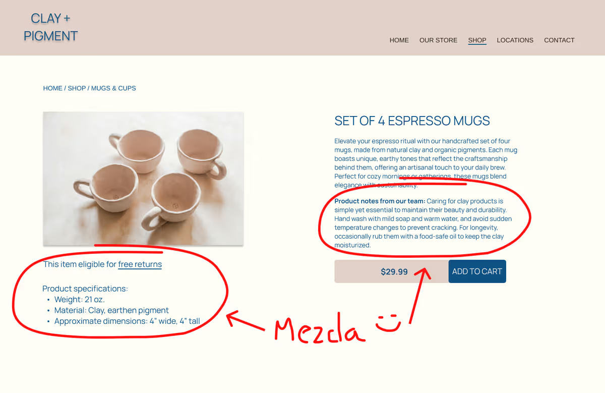
The return policy was an interesting issue. While the company offers a 30-day free return policy for in-store purchases, they were hesitant to offer the same for their online shop due to being a smaller business. The owners were concerned that shipping costs might take a toll on their bottom line.
We came up with two solutions that mutually benefitted the users and the store owners. First, we added a link to the return policy with clear language on each product page. Second, we added additional notes in the descriptions of items that either were unique in some manner (particular sizing, special material, or other qualities) or had a track record of being returned

